AI White Background Product Photos
AI white background tools are useful when a seller needs cleaner catalog images fast. They can remove a messy room, supplier-photo gray, table edge, harsh shadow, or distracting prop without scheduling a new shoot. The practical question is not whether a white background looks clean. The question is whether the final image still matches the product that ships and fits the channel slot where it will appear.
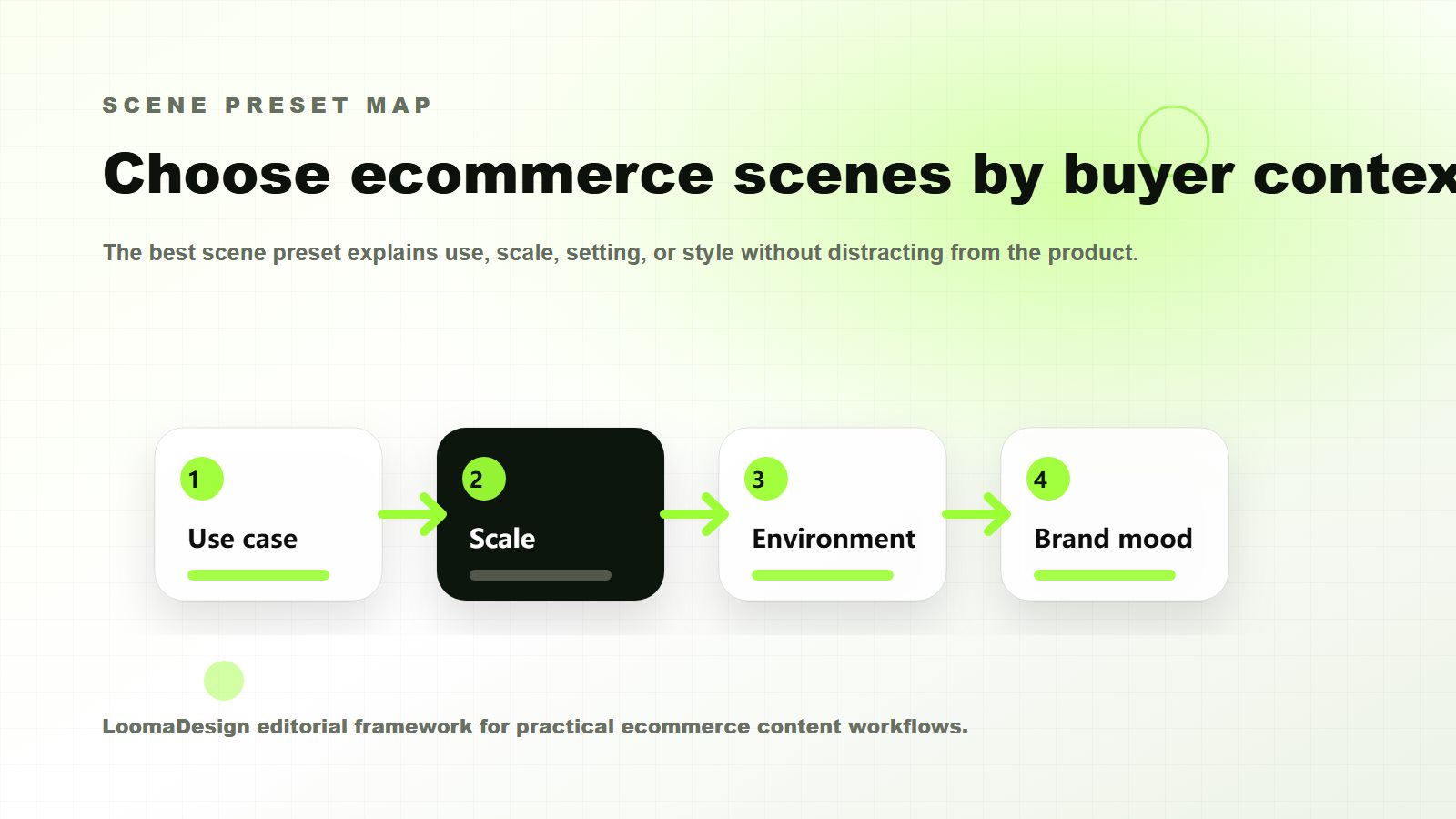
White backgrounds work best when the buyer needs a clear view of the item. They are weaker when the image needs to explain use, scale, texture in context, or the reason someone would choose the product over another option. A good ecommerce workflow usually needs both clean product-first images and scene-led images that answer buyer questions.
Quick Answer
Use an AI white background when the product already exists in the photo and the background is the problem. Keep the product shape, color, logo, edge detail, texture, shadow, and scale intact. Review the result against the original image before upload, especially for Amazon main images, Shopify product galleries, and Shopping feed assets.
Reserve white backgrounds for the slots where buyers need a factual product view. Main images, catalog tiles, thumbnails, comparison layouts, and SKU selection often need clarity. Secondary images, PDP sections, A+ modules, ads, and storefront visuals often need context. The best background for product photography depends on what the buyer still needs to understand.
When a White Background Is the Right Choice
A white background works best when the image needs to reduce doubt about the exact item. Buyers can see the product shape, color, packaging, included parts, and proportions without a scene competing for attention. That matters on marketplace listings, product grids, comparison pages, bundle layouts, and any place where the image is used as a factual product reference.
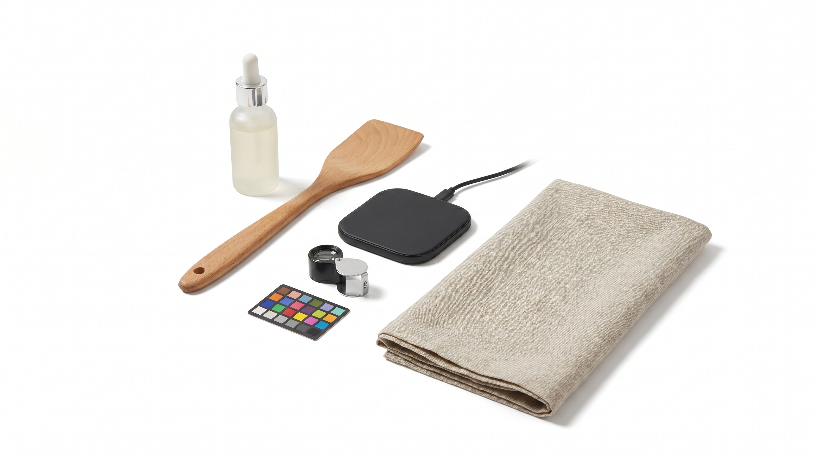
White is also useful when a catalog needs consistency across many SKUs. A store with twenty kitchen tools, skincare bottles, cables, supplements, or accessories can look messy if every supplier photo uses a different table, lighting setup, wall color, or crop. AI background cleanup can make the catalog easier to scan when the cleanup keeps edges and important detail intact.
For Amazon sellers, review the current image slot before relying on a generated result. Amazon Ads' product detail page guidance recommends high-quality images, a plain white background for core product images, product fill of at least 80 percent, and large enough image dimensions to support zoom. Supporting images can carry more context, while the product-first image needs a stricter standard than a lifestyle image.
Shopify gives brands more visual freedom, but the image still has to survive the theme. A photo that looks clean in an editor can become weak after square cropping, mobile display, collection-grid compression, or zoom behavior. Shopify's product media guidance is useful because it reminds teams to treat the asset as product media that must work inside the store.
When a White Background Is the Wrong Background
A white background can make a product look accurate and still fail the buyer. If the item needs context, scale, or use-case explanation, a plain background may leave the shopper guessing. A compact travel pouch, desk lamp, cleaning brush, pet accessory, or skincare product often needs at least one scene that shows where it belongs and how large it feels.
That is where AI backdrops and product background AI tools become useful. The scene should answer a specific buyer question. A kitchen scene can show daily use. A bathroom counter can show routine fit. A desk setup can show scale beside a laptop. A suitcase scene can show travel use. The scene should not make the product look more expensive, larger, more weatherproof, or more complete than it really is.
| Image role | Best background | Why it works | Main risk |
|---|---|---|---|
| Marketplace main image | White background | Keeps the item clear and product-led | AI cleanup may change edges, shadows, or included parts |
| Product grid or catalog tile | White or neutral studio | Makes many SKUs easier to compare | Repeated crops can make different products look the same size |
| Shopify gallery detail image | White, neutral, or light studio | Helps buyers inspect material, texture, packaging, and finish | Over-cleaning can remove useful shadow and depth |
| Secondary lifestyle image | Realistic AI backdrop | Shows use case, scale, and setting | The scene can imply claims or accessories |
| PDP or A+ module image | White plus callout or controlled scene | Supports a product feature or buyer doubt | The background can distract from the point |
| Ad creative | Scene-led background | Creates campaign variation fast | Creative can drift away from the product page |
The White Background QA Checklist
Review the final image beside the original source photo. A clean result can still be wrong if the cap shape changed, the zipper moved, the logo blurred, the bottle became taller, or the shadow makes the product look like a different material.
Use this checklist before upload:
- Product edges: no cut-off handles, seams, straps, transparent parts, or soft halos.
- Shape and proportions: the item should keep the same height, width, thickness, and silhouette.
- Color: compare against the source image and product page copy, especially for black, white, metallic, cream, transparent, and reflective products.
- Logo and packaging: text should be either readable or intentionally hidden, not half-invented.
- Included items: show only accessories, bundles, props, or attachments that ship with the SKU.
- Shadow: keep enough grounding to make the product feel real, but avoid heavy shadows that break channel expectations.
- Crop: check square, vertical, horizontal, thumbnail, and mobile crops.
- File quality: export large enough for the channel and avoid repeated compression.
Amazon, Shopify, and Shopping Feed Differences
Amazon, Shopify, and Google Shopping assign different jobs to product images. Amazon main images need stricter product-first review. Shopify galleries can carry more brand context, but theme display and mobile crops still affect quality. Google Merchant Center image guidance focuses on clear product representation in feed assets, and its AI-generated content guidance requires embedded DigitalSourceType metadata for AI-generated images in Merchant Center.
For a seller, the operating rule is simple: decide the destination before choosing the background. A white-background image meant for a main listing should be treated as product evidence. A Shopify lifestyle image can be more editorial, but it still cannot misrepresent color, scale, materials, or included items. A Shopping feed asset needs a clean product representation that can pass automated and human review.
Google has also announced stricter image-size requirements that take effect on January 31, 2027. Today's publishing rules remain in place, but tiny supplier files create future cleanup. Building higher-resolution product-image workflows now reduces later cleanup.
A Practical Workflow for AI White Background Images
Start with the cleanest real product photo available. If the source image is pixelated, heavily compressed, or shot at a strange angle, background cleanup will not solve the real problem. Use LoomaDesign's image enhancer or a reshoot before asking AI to create the final marketplace image.
Next, remove or replace only the background. Give the tool a conservative instruction: preserve product shape, color, logo, material, and scale. Ask for product-level retouching only when the changes can be reviewed against the real SKU.
Then create a small image set:
- A clean white-background image for product-first inspection.
- A neutral studio version if the product needs depth or premium presentation.
- A lifestyle scene for use case, scale, or buyer context.
- A cropped thumbnail version for mobile and product grids.
- A final export version sized for the channel.
This sequence gives the seller control. The white image anchors the product truth. The neutral and lifestyle images add context. The QA step prevents the generated background from becoming a product claim.
Common Mistakes
The most common mistake is choosing the cleanest-looking output over the most accurate output. A perfect white background is not helpful if the AI removed a strap, smoothed a logo, changed the cap, or made a small item look full-size.
Another mistake is using one white-background file everywhere. A product grid may need square consistency. A PDP hero may need more space. An A+ module may need a feature callout. An ad may need more scene context. Reusing the same file saves time at first and creates weak presentation later.
Sellers also underestimate shadows. Removing every shadow can make a real product look like a sticker. Keeping a harsh studio shadow can make a marketplace image look unfinished. A light, natural grounding shadow is often the safer middle ground.
Build White-Background Sets in LoomaDesign
LoomaDesign is useful when the seller needs more than one background-removal output. A practical product-visual workflow often starts with a real SKU image, improves clarity with the image enhancer, creates a clean product-first file with the white background tool, then adds controlled product scenes with the Amazon lifestyle image generator.
For broader workflow planning, pair this article with the AI product photography guide for Shopify and Amazon, the Amazon listing image generator guide, and the commerce scene presets guide. Those resources cover when to move from product-first images into scene-led product storytelling.
FAQ
Can I use AI white background product photos on Amazon? Often yes, but the final image must meet the relevant image requirements and accurately represent the product. Treat the AI output as a draft until product edges, color, included items, shadow, and crop have been checked against the real SKU.
Is a white background always best for ecommerce product photography? No. White backgrounds are useful for product clarity, main images, grids, and catalog consistency. Lifestyle scenes are better when the buyer needs to understand use, scale, fit, environment, or occasion.
What is the best background for product photography? The best background is the one that helps the buyer make the next decision. Use white for inspection, neutral studio for detail and brand consistency, and lifestyle scenes for context.
Can AI background tools change the product? Yes. Background removal and replacement can damage edges, erase transparent parts, distort shadows, shift color, or invent missing detail. That is why every final image needs product QA before upload.