AI Product Image Generator for Comparison Images: Turn Product Differences Into Buyer Proof
An AI product image generator can create useful comparison images when the comparison starts with a buyer decision. The image should help someone choose between sizes, colors, bundles, materials, features, or use cases without misreading the product.
Many ecommerce comparison images fail because they copy a spreadsheet into a graphic. They list ten specs, add check marks, and hope the buyer studies the whole thing. Most buyers scan. They want to know which option fits their problem.
Good comparison images make one tradeoff visible.
Quick Answer
Use an AI product image generator for comparison images when you already know the decision the buyer needs to make. Choose one comparison type, protect the product facts, generate the visual proof, and review the result against the real SKU before the image goes live.
The strongest comparison images usually compare one of five things: size, included parts, feature differences, variant differences, or use-case fit. Keep the product shape, label, color, scale, accessories, packaging, and claims unchanged.
For ecommerce teams, a good comparison image reduces hesitation before the buyer reaches the cart.
Why Comparison Images Matter on Product Pages
Product pages already ask shoppers to compare. A buyer compares a 500 ml bottle against a 750 ml bottle. A backpack buyer compares laptop fit, pocket layout, fabric, and travel use. A skincare buyer compares serum, cleanser, and cream inside one routine. A small appliance buyer compares capacity, cleaning parts, controls, and counter space.
If the product page leaves those differences in paragraph copy, many buyers miss them. If the page shows them as product comparison images, the buyer can judge faster.
This is especially useful on mobile. A wide comparison table may collapse badly. A carefully designed image card can show the same decision with product photos, two or three data points, and a clear visual difference.
Comparison images work best when they answer a question the buyer already has:
- Which size should I buy?
- What comes in the box?
- Which variant is this?
- How is this model different from the cheaper one?
- Is the premium version worth it?
- Which product fits travel, office, kitchen, gym, or gifting?
If the image misses those questions, it is probably decoration.
Pick One Comparison Type
A single comparison image works best when it avoids comparing everything. Choose the type that matches the buying hesitation.
| Comparison type | Best for | Visual proof to include |
|---|---|---|
| Size comparison | bottles, bags, appliances, organizers | scale object, dimensions, hand or counter reference |
| Feature comparison | electronics, tools, kitchen products | closeups, icons, supported claims |
| Bundle comparison | kits, accessories, skincare sets | included parts, count, packaging |
| Variant comparison | colors, capacities, models | accurate swatches, product views, labels |
| Use-case comparison | travel, home, office, outdoor | realistic scene, product in use |
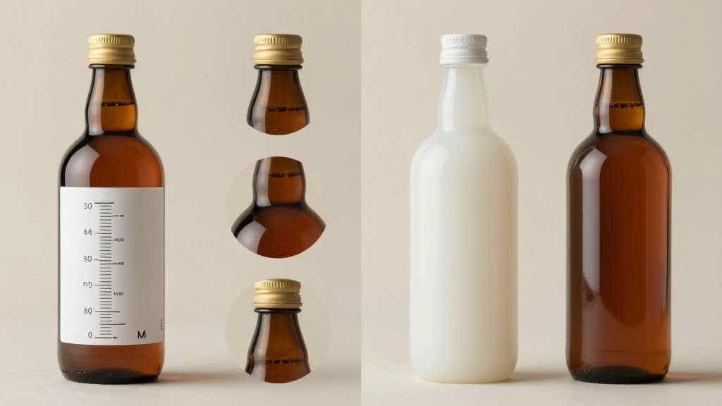
Size comparison usually needs fewer words. A 500 ml bottle beside a 750 ml bottle, with both shown at the same camera angle, can explain more than a dense spec table.
Feature comparison needs more discipline. It is easy to turn the image into a sales poster. Show the exact part that supports the claim. If a backpack claims laptop protection, show the laptop compartment. If a skincare bottle claims a pump dispenser, show the pump. If an appliance claims easy cleaning, show the removable part only if that part ships with the product.
Bundle comparison creates many AI image risks. A generated image may add an extra cable, scoop, pouch, dropper, brush, cap, or insert. Treat the included-parts image as a packing list. Anything outside the box should stay out of the image.
Build a Product Truth Sheet First
Before generating comparison images, write a short product truth sheet. This gives the AI prompt and the human reviewer the same reference.
For an insulated bottle set:
- products: 500 ml, 750 ml, and 1 liter bottles
- fixed facts: same cap style, same logo position, same stainless-steel body shape
- variants: black, silver, olive
- allowed comparisons: capacity, height, lid type, cup holder fit, carry handle
- banned additions: straw lid, second cap, carabiner, fake temperature display, extra packaging
- final channel: PDP gallery, Amazon secondary image, Shopify product page
For a skincare kit:
- products: serum bottle, cream jar, cleanser tube
- fixed facts: label text, cap type, package size, liquid color, tube shape
- allowed comparisons: routine order, texture, bottle size, included items
- banned additions: claims, certification marks, ingredient badges, extra tools, different formula color
- final channel: PDP gallery and landing page section
This sheet turns comparison image generation into a controlled production task. It also helps a team reject attractive images that quietly change the offer.
Prompt the Image Around the Decision
Generic prompts usually produce generic comparison graphics. The prompt should name the decision, the product facts, the layout, and the review constraints.
For size comparison:
> Create an ecommerce product comparison image from these product references. Show the 500 ml, 750 ml, and 1 liter versions side by side at the same camera angle. Keep the bottle shape, cap, logo position, material, color, and proportions unchanged. Add simple capacity labels and a neutral scale reference. Use a clean product-page layout with enough white space for mobile viewing. Exclude extra lids, straws, handles, packaging, platform logos, and marketing badges.
For bundle comparison:
> Create a product-page comparison image showing what is included in each bundle. Keep all product parts accurate to the reference images. Arrange the standard kit and premium kit side by side. Show only the items that ship in each box. Use clean lighting, consistent shadows, and a checklist-style layout. Exclude invented accessories, cables, tools, labels, certification marks, and extra packaging.
For use-case comparison:
> Create an ecommerce comparison image that helps buyers choose between home, office, and travel use. Use the same product reference in three realistic scenes. Keep the product shape, size, color, label, and included parts unchanged. Show one practical proof point per scene. Keep the product accurate and avoid fake features or unreadable UI text.
The wording is plain on purpose. A comparison image has less room for creative interpretation than a lifestyle scene.
Design the Image for Mobile First
Comparison images often look fine on a desktop artboard and fail in a mobile gallery. Small text, five-column tables, tiny icons, and long footnotes disappear after upload.
Use these mobile rules:
- compare two or three options, not six
- keep one decision per image
- use the same camera angle for compared products
- keep product photos larger than icons
- use short labels such as 500 ml, 750 ml, office, travel, kit, bundle
- avoid paragraphs inside the image
- test the final crop at mobile thumbnail size
If the buyer needs a magnifying glass to read the image, the layout is doing too much.
Many product comparison charts work better as image sequences. Create three separate images for size, included parts, and use case. The gallery becomes easier to scan and the seller keeps more control over each claim.
Category Examples
For bottles and drinkware, compare capacity, lid type, grip, cup holder fit, leak use case, insulation claim, and cleaning parts. Use the same camera angle for size comparison. Keep the cap and handle accurate.
For backpacks and bags, compare laptop size, pocket layout, strap comfort, material, travel use, and interior capacity. A flat table of features is weaker than a side-by-side photo showing compartments and scale.
For skincare and beauty, compare routine order, product type, package size, texture, shade, and included items. Be careful with claims. Use badges or ingredient promises inside the image only after brand approval.
For small kitchen appliances, compare capacity, counter footprint, removable parts, cleaning effort, control layout, and result. If the image shows food, make sure it avoids extra accessories or a cooking result the product cannot support.
For electronics and accessories, compare ports, compatibility, cable length, size, finish, included parts, and device fit. The comparison image should show the exact connector, edge, or slot that supports the claim.
QA Before Publishing
An AI-generated comparison image needs a stricter review than a plain lifestyle image because it combines product photography, layout, and claims.
Review these items before publishing:
- product shape matches the real SKU
- colors match approved variant references
- labels and logos are not invented or distorted
- included parts match the box contents
- dimensions and capacity are correct
- product scale is consistent across options
- comparison claims are supported by product data
- mobile crop still keeps the key difference visible
- competitor comparisons have legal review
- the image avoids discounts, warranties, certifications, or performance claims that are missing from the product page
The safest comparison image is usually specific, narrow, and easy to verify.
LoomaDesign Workflow for Comparison Images
LoomaDesign is useful when a seller has a product photo and still needs product-page visuals around it. A comparison image often needs several production steps: clean product views, variant cards, scale images, feature closeups, and a final PDP-ready layout.
Start with the comparison the shopper actually makes. For a bottle, that may be capacity and lid type. For a bag, it may be laptop fit and pocket layout. For a skincare set, it may be routine order and package size. LoomaDesign works best when the first output is a decision image, not a generic comparison chart.
Use Product Detail Page Images to create gallery images, comparison cards, A+ style modules, and visual proof sections. Use Additional Product Images when the product page needs more angles, included-parts layouts, or variant support. Use Scene Replacement when the comparison needs a realistic use case beyond a plain product board.
A good first test is one side-by-side image with two or three options, one proof point, and no claim that needs legal review. If that image still reads on a phone and the product facts stay correct, the same structure can support a fuller PDP gallery or A+ comparison module.
For related workflows, read AI Product Image Generator for Product Bundles, Amazon Listing Images Design, and Product Background AI for Home and Kitchen Products.
FAQ
Can AI create ecommerce product comparison images?
Yes, if the product references and comparison brief are specific. AI can help create side-by-side product images, bundle layouts, size comparison cards, and use-case visuals. The team still needs to check SKU accuracy, included parts, labels, scale, and claims before publishing.
Should a comparison image include text?
Use short labels only. Capacity, size, model name, use case, and one or two feature words are usually enough. Long text blocks should stay in the product page copy or A+ module.
Can I compare my product to a competitor in an image?
Do this only with legal and marketplace review. Many sellers get better results by comparing their own variants, bundles, or use cases. That keeps the image useful without creating claim risk.
What makes a product comparison image high-converting?
It helps the buyer choose faster. The product difference must be visible, accurate, and tied to a real decision such as size, fit, bundle contents, material, or use case.
Where should comparison images appear?
Use them in the PDP gallery, Amazon secondary images when compliant, A+ content modules, landing pages, product quiz results, and retargeting creatives. Test mobile readability before using them as a main gallery image.
Sources and Data Points
- NN/g: UX Guidelines for Ecommerce Product Pages
- Baymard Institute: Current State of Ecommerce Product Page UX
- VWO: eCommerce Product Page Best Practices
- Amazon Ads: Improve your products for advertising
- Google Search Central: Google Images best practices