Amazon Listing Images Design: Main Image, Gallery, Lifestyle, and A+ Visual Flow
Amazon listing images design is often treated like a packaging task. A seller asks for a main image, a few infographics, a lifestyle scene, and maybe A+ Content once the listing is live. The result can look polished and still feel disconnected. The main image has one visual style, the gallery has another, the lifestyle scene tells a different story, and the A+ modules look like a separate landing page dropped underneath the listing.
The better approach is to plan the full visual flow before any single image is finished. The main image should win recognition. The secondary gallery should answer buyer questions in a clear order. Lifestyle scenes should show use without hiding product facts. A+ Content should deepen the same claims and proof points, not restart the pitch.
Quick Answer
Amazon listing images design should begin with a visual flow map. Decide what the main image must identify, what each secondary image must prove, which lifestyle scene supports the use case, and which A+ Content modules should expand the same buying arguments. Amazon Ads recommends four or more high-quality product images, showing the product from different angles, highlighting details and features, and demonstrating use. Amazon also describes A+ Content as a way to add enhanced images, customized text placements, videos, and comparison charts to product detail pages.
For most ecommerce teams, the design problem is not a lack of attractive images. The problem is weak sequencing. A buyer should understand the product faster after each image, not feel like the same promise is being repeated in different layouts.
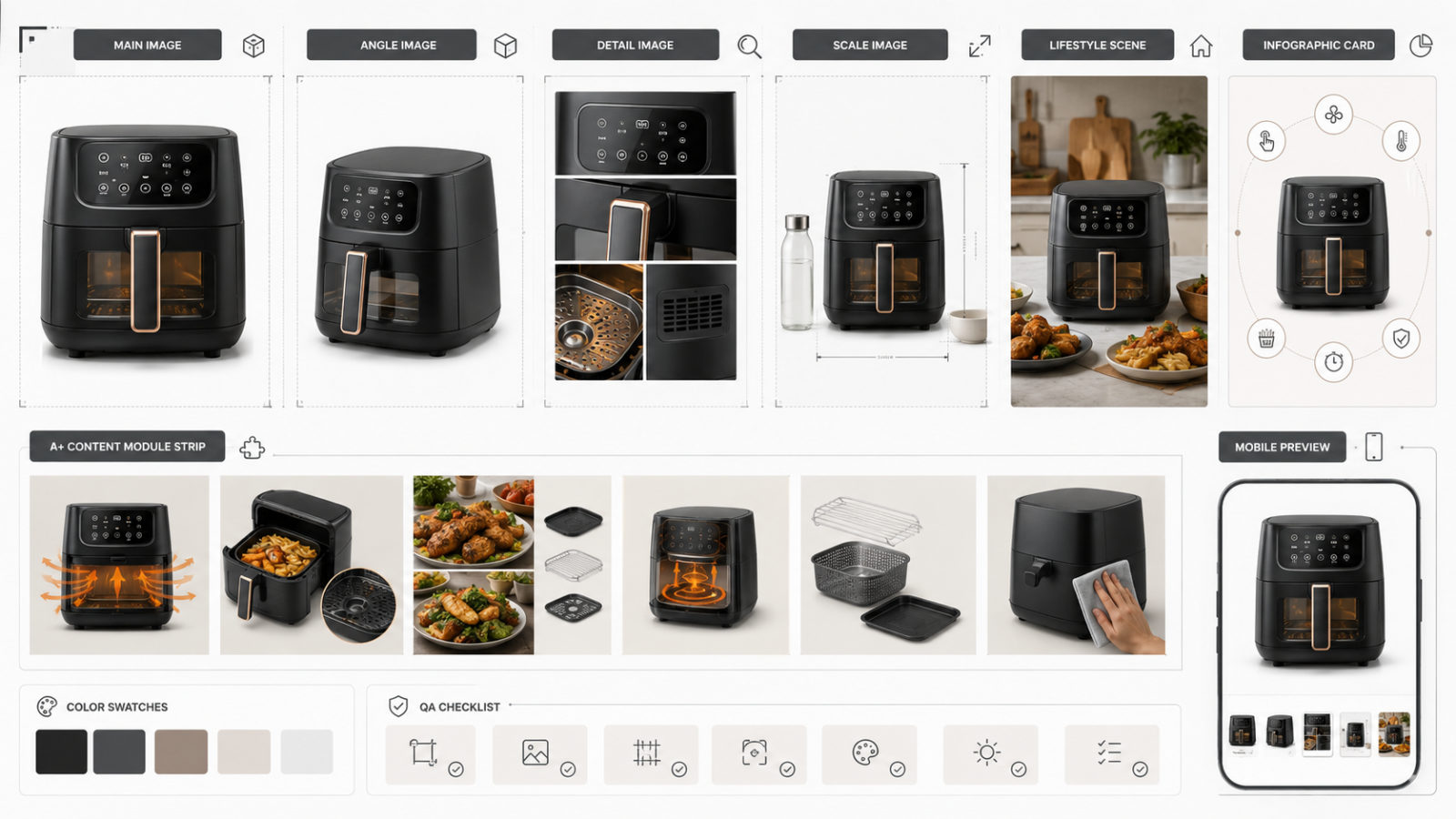
Design the Listing as a Visual Conversation
A product detail page gives the buyer several chances to understand the product. The search thumbnail creates the first impression. The main image confirms the item. The secondary gallery answers fast questions. A+ Content gives the brand more room to explain, compare, and reduce hesitation.
When those parts are designed separately, the buyer has to work harder. A kitchen appliance may look clean in the main image, but the gallery may never show countertop scale, cord placement, washable parts, texture, controls, or what fits inside the product. A+ Content may spend space on brand language while the buyer still wants proof that the appliance fits under a cabinet.
The design flow should start with the questions a buyer asks in order.
| Buyer question | Best visual answer | Where it usually belongs |
|---|---|---|
| What is this exact product? | clean product view, correct variant, readable silhouette | main image |
| What does it look like from another angle? | side, back, top, open, or detail angle | early gallery |
| How big is it? | scale reference, hand, counter, shelf, body, device, or room context | gallery |
| What makes it different? | feature proof, detail closeup, comparison, use result | gallery and A+ |
| Can I use it the way I expect? | realistic lifestyle scene or step image | gallery |
| What options or bundles exist? | variant, pack, included parts, comparison chart | gallery and A+ |
| Can I trust the brand? | A+ story, material proof, care, warranty, comparison | A+ Content |
This map prevents a common Amazon image listing problem: too many visuals competing for the same job.
Main Image Design Should Stay Conservative
The main image has a narrow role. It needs to identify the exact product quickly, especially in search and on mobile. Amazon Ads guidance says product images should use a plain white background and that the product should fill at least 80% of the image area. Seller-facing image rules are stricter for the main image than for secondary images, so most design ambition belongs elsewhere.
For a small countertop appliance, the main image should show the exact color, body shape, controls, lid, handle, visible accessories if included, and enough depth to avoid a flat silhouette. The product should not look smaller than it is, but it should also not be cropped so tightly that important parts are cut off.
AI image editing can help clean edges, improve lighting, or remove background noise from the source image. It should not change the appliance surface, button layout, lid shape, power cord, accessory set, or color. A more premium-looking main image is a bad trade if it weakens product accuracy.
The Gallery Should Move From Recognition to Proof
Secondary Amazon listing images do not need to repeat the main image. They need to expand it.
For a countertop appliance, the first gallery image can show angle and depth. The next can show scale on a counter, under a cabinet, beside a mug, plate, bottle, or hand. A detail image can show controls, texture, opening mechanism, removable parts, cable, or material finish. A use image can show the product in a real kitchen workflow. A comparison image can show capacity, dimensions, or model differences. A final image can show what comes in the box.
The order matters because most buyers do not study every image with equal attention. Put the strongest uncertainty reducers early. If the product is expensive, technical, or easy to misunderstand, use the first three secondary images to clarify shape, scale, and function before moving into lifestyle or brand mood.
| Gallery position | Design job | Example for a countertop appliance |
|---|---|---|
| Image 2 | structure | front, side, top, open view, or depth |
| Image 3 | scale | on counter, under cabinet, hand reference, cord placement |
| Image 4 | detail | control panel, lid, texture, material, removable part |
| Image 5 | use | product in a realistic kitchen setup |
| Image 6 | comparison | size, capacity, included parts, or model options |
| Image 7 | proof | cleaning, storage, safety, pack contents, or care |
This structure is flexible. The point is to stop designing each slot as a standalone graphic.
Lifestyle Images Need Product Discipline
Lifestyle scenes can make a product feel real, but they often fail in two ways. Some scenes hide the product inside a beautiful room. Others add props that make the offer look bigger than it is.
For Amazon listing images design, a lifestyle scene should still answer a concrete question. Does the appliance fit a small kitchen? Can it sit near a sink? Does it match modern countertops? Can one person use it easily? Does the cord placement matter? Is the lid clearance enough? Will the product look compact or bulky when used?
The scene should show use, scale, and context without creating false claims. If a bowl, bottle, tray, cup, utensil, filter, accessory, or ingredient is not included, the image should not make it look like part of the purchase. If the scene implies a result, the listing should support that claim elsewhere.
Amazon Ads also publishes guidance for shoppable images in Brand Stores, where lifestyle visuals can help customers see products in real settings and move to product detail pages. The same design discipline applies to listing images. The scene should inspire interest while protecting the product facts.
Infographics Should Be Mobile-Readable
Infographic images are useful when the buyer needs a quick explanation. They are weak when they become crowded mini-brochures.
Use fewer callouts. Make text large enough for mobile. Keep each label tied to a visible product detail. Avoid repeating bullet points that already appear in the listing. For small appliances, useful infographic topics include capacity, removable parts, material, controls, cleaning steps, safety features, storage dimensions, included accessories, and comparison against older models.
Designers sometimes put the most important claim in small text because the full-size desktop mockup looks readable. That is a poor test. Preview every infographic at mobile gallery size before approval. If the buyer has to pinch or zoom to read the main claim, the design is trying to do too much.
A+ Content Should Extend the Same Visual System
A+ Content gives more room for enhanced images, customized text placements, videos, comparison charts, and brand content. That does not mean it should reset the visual direction.
For a countertop appliance, the gallery may answer what the product is, how large it is, how it opens, and how it is used. A+ Content can then deepen material quality, explain cleaning, compare models, show a use sequence, present a brand story, and add a comparison chart. If the A+ modules repeat the gallery with bigger images and more text, they waste the space.
A simple A+ flow might look like this.
| A+ module | Best use |
|---|---|
| Hero module | product promise and clean visual identity |
| Feature row | three to four features already proven in the gallery |
| Detail strip | material, controls, removable parts, or care |
| Use sequence | step-by-step use or cleaning workflow |
| Comparison chart | model, bundle, capacity, or feature differences |
| Brand block | support, design philosophy, warranty, or category fit |
Good Amazon listing images design makes the page feel connected from top to bottom. The buyer should not feel like the gallery came from one team and A+ Content came from another.
When to Use Amazon Listing Images Services
Amazon listing images services can help when a seller needs creative direction, category research, photography, retouching, A+ module design, or a full image package. A service is useful when the brand lacks a repeatable image system or when the product category needs careful visual proof.
The deliverables should be specific. Ask for a main image, angle image, detail image, scale image, lifestyle image, feature proof image, variant or bundle image, and A+ module direction. Also ask for mobile previews and source files. A package that only promises "premium graphics" is harder to review.
AI tools can reduce production time once the visual flow is clear. They are useful for scene exploration, secondary image concepts, background variation, A+ drafts, and final enhancement. The safest setup uses human judgment to decide the proof flow, then AI to help generate controlled variations around that flow.
QA Before Publishing
Before publishing the listing image set, review the full flow as one buyer experience.
- The main image identifies the exact product quickly.
- The gallery does not repeat the same proof in multiple slots.
- Scale is clear before the buyer reaches A+ Content.
- Lifestyle images keep the product visible and accurate.
- Infographic text is readable on mobile.
- A+ modules extend the gallery instead of repeating it.
- Variant images match the correct SKU.
- AI-edited images do not change shape, color, parts, material, or included accessories.
- Product claims in images match the title, bullets, description, and A+ Content.
- The image set still works when viewed quickly on a phone.
This review catches many issues that individual image approvals miss.
How LoomaDesign Fits
LoomaDesign helps ecommerce teams turn a product brief into a connected product visual workflow. Use the A+ Content Image Tool to plan secondary listing images, create controlled lifestyle scenes, draft A+ visual directions, clean product images, and prepare final exports.
For Amazon listing images design, the best use is not one isolated hero image. Start with the full image flow, create each slot around a buyer question, and use LoomaDesign to produce or refine the visuals that need speed, consistency, and QA control.
For supporting production checks, pair this guide with the Amazon listing image size requirements guide, the Amazon product listing image best practices 2026 guide, and the bags and accessories category example.
FAQ
What is Amazon listing images design?
Amazon listing images design is the planning and production of the main image, secondary gallery, lifestyle scenes, infographics, variant visuals, and A+ Content visuals as one connected product detail page flow.
What should the first Amazon listing image show?
The first image should show the exact product clearly on a plain white background, with enough size and clarity to work in search and on mobile. Most creative context should appear in secondary images or A+ Content.
How is Amazon listing images design different from A+ Content design?
Listing images work near the top of the product detail page and should answer fast buyer questions. A+ Content gives more room for enhanced images, text placements, video, comparison charts, and brand explanation.
Can AI design Amazon listing images?
AI can help create secondary scenes, layout options, A+ drafts, and enhanced exports. It still needs product-truth QA because generated images can change material, color, parts, scale, packaging, or included accessories.
What should an Amazon listing images service deliver?
A useful service should deliver a planned image sequence, not only polished graphics. At minimum, expect a main image, angle image, detail image, scale image, lifestyle image, feature proof image, variant or bundle image, and A+ module direction.
Sources and Data Points
- Amazon Ads, "How to improve your product detail page for advertising", guidance on four or more high-quality images, plain white backgrounds, product fill, and product detail page improvements.
- Amazon Sell, "A+ Content", guidance on enhanced images, customized text placements, videos, comparison charts, and AI-assisted A+ content generation.
- Amazon Ads, "Building connections with shoppable images on your Brand Store", guidance on lifestyle visuals, real-life settings, and product detail page navigation.
- Recent seller community discussions around SKU image handling, A+ image quality, mobile readability, listing image services, and visual package deliverables were used to shape the image-flow checklist.