Best Background for Product Photography by Product Category
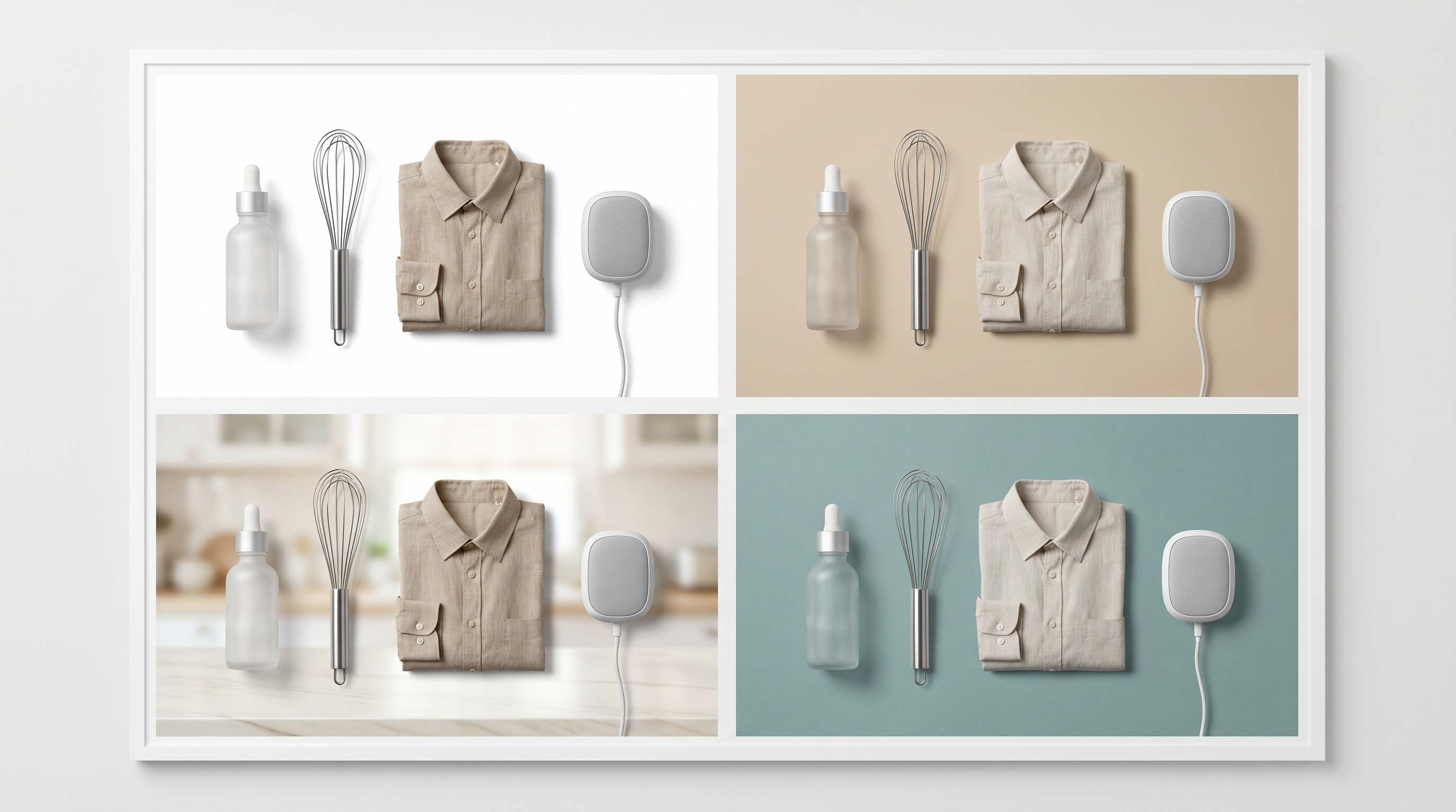
The best background for product photography depends on the product category, not just the brand style. A white background can be correct for a marketplace main image and weak for a brand story. A lifestyle scene can make a kitchen tool easier to understand and make a small electronics accessory look cluttered. A colored paper sweep can help a beauty SKU stand out and distort the perceived shade of apparel.
For ecommerce sellers, the background should answer a buyer question. What is included? How large is it? What material is it? Where would I use it? Does it match the variant I selected? Once you define that question, background choice becomes more practical.
Quick Answer
Use white backgrounds for main product recognition, catalog grids, marketplaces, and comparison views. Use neutral studio backgrounds when the product needs depth without losing clarity. Use lifestyle backgrounds when buyers need scale, use context, or room fit. Use colored or textured backgrounds only when they support the product category without changing perceived color, size, material, or value.
For AI product backgrounds, build a small background system by category instead of generating a new look for every SKU. The goal is consistency buyers can trust.
The Background Decision Framework
Before picking a surface or scene, answer four questions:
- Where will the image appear?
- What product fact must the buyer understand?
- Which detail must stay accurate?
- What background style can repeat across the category?
This avoids the common mistake of treating product backgrounds as decoration. A clean background that hides scale, texture, or included parts is not actually clean. It is incomplete.
| Image role | Best background type | Why it works |
|---|---|---|
| Marketplace main image | Pure white or compliant white | Fast SKU recognition and feed clarity |
| Shopify product gallery | White plus neutral studio | Consistent product-first browsing |
| A+ or PDP module | Neutral, lifestyle, or use-case scene | Explains a feature or benefit |
| Paid ad | Simple studio or controlled lifestyle | Gives context without clutter |
| Variant image | Identical background across variants | Makes color and shape comparison easier |
| Detail close-up | Neutral surface | Protects texture, material, and edge clarity |
For a dedicated plain-background workflow, use AI white background product photos. This article goes deeper by category and SKU behavior.
Category Recipes You Can Reuse
Use these as starting points when planning a catalog refresh. They are intentionally specific because broad background advice often fails once the team starts working through real SKUs.
Skincare Pump Bottle
Use a pale stone shelf, soft bathroom counter, or clean vanity surface. Keep the bottle upright, the pump shape visible, and the label unobstructed. If the bottle is translucent, keep the background light enough to show the liquid level without making the product look more filled than it is.
Good image set:
- catalog view on a plain surface
- vanity scene with one supporting prop
- close-up of pump, cap, or texture
- routine image that shows hand scale without hiding the label
USB-C Hub or Cable Accessory
Use a light gray desk, matte table, or laptop-adjacent setup. The background should make connector shape and port count obvious. A beautiful workspace is less important than proving compatibility.
Good image set:
- clean top-down product view
- connector close-up on a neutral desk
- laptop or monitor use-context scene
- included-cable or included-parts layout
Linen Shirt or Folded Apparel
Use a neutral fabric surface, light gray sweep, or model context depending on the selling point. If the article is about color, keep the surface neutral. If the article is about texture, use a close crop with enough side light to show weave.
Good image set:
- color-accurate flat lay
- fabric texture close-up
- model or outfit scene for fit context
- variant grid with the same background across colors
Vacuum Attachment or Small Home Tool
Use a clean floor, shelf, countertop, or in-use room context. The background should show where the part attaches or how the tool is held. Do not let the scene imply extra accessories that are not included.
Good image set:
- exact-item view
- included-parts layout
- use-context scene
- connection or compatibility close-up
Ceramic Mug, Bowl, or Tableware
Use a neutral table, kitchen counter, or simple dining setup. Keep rim shape, glaze, handle, and interior color visible. Avoid props that hide size or make the product look like part of a larger set.
Good image set:
- single-item catalog view
- top angle for interior color
- hand or table context for scale
- glaze or finish close-up
Beauty, Skincare, and Supplements
Beauty and supplement products need backgrounds that keep packaging readable. White, off-white, soft gray, light stone, and pale neutral surfaces usually work best. The background should not compete with label copy or change perceived packaging color.
Use:
- white for marketplace and SKU tiles
- light neutral studio surfaces for product galleries
- bathroom counter, vanity, or shelf scenes for lifestyle slots
- controlled ingredient scenes only when they do not imply unsupported claims
Avoid:
- busy marble that fights label text
- colored lighting that changes bottle color
- over-wet spa styling for products not used that way
- ingredient props that imply a formula claim
AI backgrounds are useful for creating consistent shelf, vanity, or soft-studio variants. Review label clarity after every generation. If the label becomes softer than the source, the background is hurting the product.
Apparel, Shoes, and Accessories
Apparel backgrounds need to protect color and fabric. A warm beige background can make cream clothing look richer, but it can also make white products look yellow. A strong colored backdrop may look fashionable and still create variant confusion.
Use:
- white or light gray for color-critical SKU images
- neutral studio for folded apparel, bags, and shoes
- lifestyle or model context when fit, scale, or use matters
- one consistent background per variant family
Avoid:
- strong color casts near white, beige, black, and denim products
- lifestyle scenes that hide silhouette
- background patterns that compete with fabric texture
- changing background style between variants
For apparel, the best background often depends on whether the image is selling color, fabric, fit, or outfit context. If the buyer needs fit, use model imagery. If the buyer needs texture, use a close-up on a neutral surface.
Electronics and Small Accessories
Electronics need backgrounds that make edges, ports, buttons, and scale visible. Pure white can work, but black, gray, silver, and translucent products may lose edge detail on white. A soft gray or light neutral studio background often gives better depth.
Use:
- white for marketplace feeds if required
- light gray studio for edges and shadows
- desk scenes when compatibility or use context matters
- close-up neutral backgrounds for ports, cables, and buttons
Avoid:
- dark scenes that hide black hardware
- cluttered desk props that distract from compatibility
- reflections that make the product look warped
- fake screen content or fake device pairing
If you are building Amazon or PDP visuals, treat the background as part of the image stack. The main image identifies the product. Secondary images explain what it works with. A+ images can show workflow, dimensions, and use context. See Amazon listing image generator for the marketplace image sequence.
Kitchen, Home, and Tool Products
Kitchen tools, home goods, and utility products often need context. A whisk, lamp, storage bin, cable organizer, or vacuum attachment can look clear on white and still leave buyers unsure about size or use.
Use:
- white for the exact item and included parts
- neutral countertop, tabletop, or room surfaces for context
- lifestyle scenes that show scale and use
- detail backgrounds that highlight material
Avoid:
- unrealistic kitchens or rooms that make the product look premium beyond its price point
- props that imply included items
- surfaces that hide the product edge
- scenes that make scale unclear
For these products, the strongest PDP usually mixes background types. Use white for recognition, neutral studio for clarity, and one controlled lifestyle scene for buyer imagination.
Jewelry, Watches, and Reflective Products
Reflective products are the hardest category for AI backgrounds. The background affects reflections, edge definition, and perceived material quality. A background that looks elegant may also create false highlights.
Use:
- light gray, soft white, or neutral gradient studio backgrounds
- controlled shadows
- simple props only when they do not touch or hide the item
- close-up neutral surfaces for detail shots
Avoid:
- busy lifestyle scenes
- hard colored reflections
- overly glossy surfaces
- AI backgrounds that change metal tone or stone color
For jewelry and watches, review the reflection as part of the product. If the background changes the metal or stone, it is not just a background issue. It is a product accuracy issue.
Furniture and Larger Home Decor
Furniture and home decor need scale and room fit. White background photos are useful for catalog browsing, but buyers also need to understand proportion, texture, and how the item sits in a room.
Use:
- white or neutral cutouts for category grids
- room scenes for size and style fit
- close-up neutral surfaces for fabric, wood, or finish
- consistent lighting across the collection
Avoid:
- rooms that make the item look larger or smaller than it is
- heavy shadows that hide legs, seams, or edges
- decor props that steal attention
- backgrounds that change wood, fabric, or metal color
For larger products, the best background set is usually: clean catalog view, room context, detail close-up, and scale-supporting crop.
Food, Beverage, and Packaged Goods
Food and beverage backgrounds need freshness without misleading the buyer. Packaging should stay readable. Props should not imply included items, unsupported ingredients, or serving results the product cannot deliver.
Use:
- white or light neutral for package clarity
- simple kitchen or table context for use
- ingredient props only when accurate
- clean shadows that keep packaging shape visible
Avoid:
- fake condensation, steam, or freshness cues when not accurate
- ingredient scenes that imply formula claims
- high-saturation backgrounds that distort packaging color
- crowded compositions that hide size or quantity
This category benefits from restraint. A background can make the product appetizing, but packaging facts still need to come first.
How to Build a Background System
Create a small set of reusable background rules instead of picking a new style for every product.
| Category | Main image | Gallery image | Lifestyle image | Detail image |
|---|---|---|---|---|
| Beauty | White | Soft neutral shelf | Vanity or bathroom context | Neutral close-up |
| Apparel | White or gray | Neutral studio | Model or outfit scene | Fabric surface |
| Electronics | White or gray | Desk setup | Use-case setup | Port close-up |
| Kitchen | White | Countertop | In-use kitchen scene | Material close-up |
| Jewelry | Soft gray | Controlled studio | Minimal wearing/context shot | Macro detail |
| Furniture | White cutout | Room scene | Styled room | Material swatch |
This system keeps the site from looking random. It also makes AI generation easier because prompts can be controlled by category.
Where LoomaDesign Fits
LoomaDesign is useful when you need to turn one product source image into a controlled visual set: white background, neutral studio, lifestyle scene, detail-page modules, and supporting ad or blog assets. The key is not to generate endless backgrounds. It is to build a repeatable product visual system that matches the SKU category.
If you want to create scene variants after choosing the background strategy, use commerce scene presets. If the source image first needs cleanup, start with AI product photo retouching tools.
FAQ
What is the best background for product photography?
For ecommerce, white is best for product recognition and marketplace feeds. Neutral studio backgrounds are best for brand consistency. Lifestyle backgrounds are best when buyers need scale, use context, or room fit. The best choice depends on product category and image role.
Should every product photo have a white background?
No. White is useful for main images, catalog grids, and marketplaces, but a complete product page often needs neutral studio images, lifestyle images, close-ups, and use-case visuals.
Are AI product backgrounds safe for ecommerce?
They can be safe when the product remains accurate. Check edges, shadows, scale, color, material, and included parts. Do not publish an AI background if it changes what buyers understand about the SKU.
How many background styles should a store use?
Most stores need fewer than they think. Use one main-image background, one gallery background, one lifestyle style, and one detail-shot style per category. Too many backgrounds make a catalog feel inconsistent.
Sources Checked
- Google Merchant Center image link requirements
- Amazon Ads product detail page improvement guide
- Shopify product media help
- Seller and ecommerce community discussions around white background, lifestyle context, and AI background trust were reviewed for real buyer objections and seller language.