How to Use Amazon A+ Content to Improve Conversion Rate: Modules, Visual Proof, and QA
Amazon A+ Content can help a product page convert better, but only when the modules answer questions the gallery and bullet points have not already solved. A polished banner with no buying proof, a lifestyle photo that repeats the main gallery, or a brand story with no product evidence may make the page longer without making the decision easier.
Amazon says adding Basic A+ Content can help increase sales by up to 8%, while well-executed Premium A+ Content can help increase sales by up to 20%. Use those numbers as directional benchmarks, not a promised lift. A+ Content improves conversion when it removes friction from the purchase decision.
Quick Answer
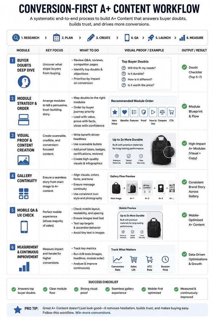
To use Amazon A+ Content to improve conversion rate, start with a high-traffic ASIN that has weak conversion, repeated buyer questions, return risk, or a product that needs more explanation than the image gallery can provide. Build the A+ section around buyer doubts: size, material, compatibility, use case, setup, comparison, care, and trust.
The strongest A+ detail pages usually connect the main gallery, bullets, and A+ modules into one buying flow. The gallery proves what the product is. The bullets state the key claims. A+ Content gives the shopper visual proof, comparison, and extra confidence before purchase.
Start With the Right ASIN
A+ Content is usually worth prioritizing for products that already receive meaningful traffic. If an ASIN has almost no sessions, a new module set may not produce enough data to read. In that case, title, search visibility, pricing, reviews, ads, or main image work may need attention first.
Good A+ candidates usually have one of these patterns: the product gets traffic but conversion is soft, shoppers ask the same pre-purchase questions, reviews mention misunderstanding, the product has features that are hard to explain in bullets, or the category requires comparison before purchase.
For example, a backpack may need proof of laptop fit, pocket layout, fabric durability, scale on body, and travel use. A kitchen appliance may need size, cleaning, use steps, included parts, safety details, and food results. A skincare product may need texture, routine order, ingredient explanation, packaging size, and shade or skin-type context.
Match Modules to Buyer Doubts
An A+ module starts with the doubt that stops a shopper from buying. Once the doubt is clear, the visual job becomes easier.
This mapping keeps the page practical:
| Buyer doubt | A+ module job | Better visual asset |
|---|---|---|
| Is this the right size? | show scale and context | body, hand, shelf, counter, or room reference |
| What makes it better? | prove the difference | feature closeup, material detail, comparison panel |
| Will it work for my use case? | show the situation | lifestyle scene with the product doing the job |
| Which variant should I choose? | reduce comparison effort | variant chart, model table, color or bundle cards |
| Is the quality real? | support trust | texture, stitching, hardware, finish, certification, care proof |
| How do I use it? | reduce setup friction | step sequence, before/after, parts diagram |
That is the practical difference between A+ Content and a general image gallery. The gallery often moves fast. A+ has more space to slow the shopper down and explain the product without forcing them to hunt through reviews or Q&A.
Use a Conversion-First Module Order
The order of A+ modules matters. A shopper who reaches A+ Content has usually seen the title, main image, gallery, price, reviews, and bullets. The first A+ module needs to deepen the decision without repeating the top of the listing.
A practical order is:
- Product promise with a clean hero visual.
- Use-case module that shows who the product is for.
- Feature proof module with detail images.
- Scale, fit, compatibility, or setup module.
- Comparison chart for variants, models, or bundles.
- Care, quality, warranty, or brand trust module.
For simple products, this sequence can be shorter. For considered purchases, the order can be expanded. The rule is that each module should make the next purchase step easier.
Connect A+ to the Image Gallery
The gallery and A+ Content need to feel connected. If the gallery says the product is compact, the A+ modules should show where it fits. If the bullets claim durable material, A+ should show the texture, seam, finish, or test context. If the listing mentions compatibility, A+ should make the compatible products or dimensions easy to compare.
This is a common conversion leak. The gallery shows one story, the bullets make another claim, and A+ Content introduces a new design direction. The page may look rich, but the shopper has to assemble the buying logic alone.
LoomaDesign's guide to Amazon listing images design covers the front-half of that flow. A+ Content should extend that image order, not restart it.
Keep Mobile Readability Strict
A+ Content is often designed on a large desktop canvas and judged on a large monitor. Many shoppers see it on a phone. Dense text, thin lines, small badges, pale contrast, and crowded comparison charts can lose their value on mobile.
Before publishing, review each module at phone width. Product images should remain recognizable. Text should be large enough to scan. Comparison charts need to stay readable without pinching. Feature icons should support the image, not replace the explanation.
Amazon's product detail page guidance recommends high-quality images, clear bullets, and detailed information that helps shoppers make better decisions. A+ modules should follow the same standard: easy to understand, visually honest, and useful at the size where buyers actually see them.
Measure the Result After Publishing
A+ Content should be measured against the product page problem it was built to solve. If the issue was low conversion, review unit session percentage or conversion rate before and after the update. If the issue was misunderstanding, watch returns, support questions, reviews, and Q&A. If the issue was model confusion, watch variant selection and comparison behavior.
Amazon also offers Manage Your Experiments for eligible content, which can help sellers test A+ Content versions. That is useful when a product already has enough traffic to produce meaningful results.
Track these items after publishing:
- sessions
- conversion rate or unit session percentage
- sales
- return reasons
- review language
- Q&A questions
- ad performance on the same ASIN
- mobile PDP review
The goal is fewer unanswered questions between first product impression and purchase.
LoomaDesign Workflow for Conversion-Focused A+ Visuals
LoomaDesign helps ecommerce teams create the product visuals that make A+ modules useful. Use the A+ Content Image Tool when the detail page needs product explanation, module structure, comparison visuals, or a clearer PDP story.
Use Amazon A+ Content AI when the team needs to turn product facts, buyer doubts, and source images into a more structured visual page. For A+ Content to support conversion, the product image set still needs QA. Color, size, material, included parts, and detail crops have to remain accurate.
FAQ
Does Amazon A+ Content improve conversion rate? Amazon says Basic A+ Content can help increase sales by up to 8%, and well-executed Premium A+ Content can help increase sales by up to 20%. Actual results depend on traffic, product fit, image quality, price, reviews, claims, module structure, and how well the content answers buyer doubts.
Which products should get A+ Content first? Start with high-traffic products that have weak conversion, recurring buyer questions, complicated features, premium positioning, high return risk, or several variants that shoppers compare.
What should the first A+ module show? The first module should usually reinforce the product promise with a strong visual and then move quickly into proof. Repeating the main image and title wastes the shopper's attention.
How many A+ modules do I need? Use enough modules to answer the product's main buying doubts. A simple accessory may need fewer modules. A premium, technical, bundled, or comparison-heavy product may need a fuller section.
Can AI create Amazon A+ Content? AI can help plan modules, draft layouts, create visual concepts, and speed up production. The final A+ section still needs human review for product accuracy, mobile readability, and compliance.
Sources and Data Points
- Amazon, A+ Content, guidance on Basic and Premium A+ Content and Amazon's stated sales lift benchmarks.
- Amazon Ads, How to improve your product detail page for advertising, guidance on images, bullets, product detail page quality, and A+ Content.
- Amazon Selling Partner, Gen AI-powered A+ Content, guidance on AI-assisted A+ Content and Manage Your Experiments.