
AI Product Image Generator for Landing Pages: Build a Full Visual Set From One Product Photo
An AI product image generator can turn one clean product photo into a full landing page image set, but the workflow needs more discipline than a prompt that asks for "marketing images."
A landing page has several jobs. It has to explain the product quickly, prove the main benefit, show the product in use, remove buyer hesitation, work on mobile, and give the brand enough visual consistency to feel credible. One product cutout rarely does all of that.
The better workflow uses an AI product image generator for landing pages in a controlled way. One accurate product reference becomes the anchor, then each new image is assigned to a specific page section.
Quick Answer
Use one product photo as the reference image, then build six landing page visuals around buyer questions: hero, use case, feature proof, scale or comparison, trust proof, and mobile crop. Each output should keep the same product shape, material, color, label, and key details.
The AI product image generator becomes a production tool when each output has a page job.
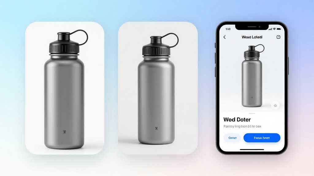
Why Landing Pages Need an Image Set
Many ecommerce teams treat landing page visuals as decoration. They use one clean product image near the top, then repeat the same image in smaller cards down the page.
That creates a weak page. The buyer sees the product, but the page leaves purchase questions unanswered.
Can it fit my space? What does the material look like up close? How large is it? What problem does it solve? Which feature matters most? What happens after I click? Does it still look good on mobile?
Those questions need different images.
| Landing page section | Image to create | Buyer question it answers |
|---|---|---|
| Hero section | clean product hero or premium scene | What is this product? |
| Problem or use case block | lifestyle scene | Where does it fit in my life? |
| Feature cards | closeups and annotated proof | What makes it useful? |
| Comparison block | side-by-side or scale image | Why choose this version? |
| Trust section | material, packaging, review-style proof | Can I believe the product quality? |
| Mobile CTA area | tight vertical crop | Does the product remain clear on phone? |
An AI product image generator becomes useful when those missing supporting visuals are treated as page decisions. It can help a team test a fuller landing page image set without scheduling a full studio shoot for every variation.
Start With One Reference Photo
The reference photo should be boring in the right way.
It should show the real SKU clearly. The product needs a visible silhouette, accurate color, clean label or hardware, and enough resolution for detail checks. If the only source photo is soft, badly cropped, or taken under colored light, improve the reference first before generating landing page variations.
For LoomaDesign, this usually means a short first pass through image improvement or background cleanup. A product that has visible edge damage, blur, or color shift will carry those problems into every AI product image generator output.
Useful starting points include:
- a clean front view
- a clear three-quarter view
- one true color reference
- one packaging or label reference
- one note about materials and surface finish
- one note about what must not change
That last note matters. AI can make a product more polished by changing the part that makes it real.
Build the Six-Image Landing Page Set
The first image is the hero. This can be a clean product-focused image, a premium environment scene, or a product-on-surface composition. The hero should carry the product shape clearly. Avoid scenes where the background has more visual weight than the SKU. For landing page product images, the product still has to win the first glance.
The second image shows the product in use. A bottle can sit beside a gym bag or office desk. A lamp can sit in a real workspace. A skincare product can appear in a bathroom routine. The scene should match the buyer's expected context, not the most dramatic prompt result.
The third image proves a feature. Closeups matter here because texture, cap design, zipper pull, handle shape, port type, stitching, coating, display panel, clasp, brush head, or material finish can become a reason to believe the copy.
The fourth image handles scale or comparison. If the product size affects the purchase, show it beside a hand, shelf, bag, desk, cup, phone, laptop, drawer, or countertop. If the product has variants, keep the lighting and crop consistent across the set.
The fifth image supports trust. Packaging, included parts, material swatches, inspection marks, warranty card, cleaning detail, or shipping-safe presentation can help a landing page feel less thin.
The sixth image is a mobile crop. Many generated images look strong on a desktop canvas and weak in a vertical mobile frame. The product may become too small, the proof point may disappear, or the image may depend on details that cannot be read. A good AI product image generator workflow checks the mobile crop before the page goes live.
A Practical Prompt Structure
A vague prompt gives the model too much room. For landing page work, write AI product image generator prompts like production briefs.
Use this structure:
- product identity
- fixed product details
- target page section
- visual purpose
- background or environment
- crop and format
- things to avoid
Example:
> Create a landing page hero image from this product reference. Keep the exact product shape, color, label placement, material finish, cap shape, and proportions unchanged. Show the product as the main subject on a clean premium desk surface with soft natural light. Leave negative space on the left for headline text. Use a 16:9 crop. Exclude extra products, badges, text overlays, fake logos, unrealistic reflections, and changed packaging.
For a feature closeup:
> Create a closeup feature image from this product reference. Keep the product material and color accurate. Focus on the cap, seam, texture, button, handle, or key detail visible in the reference. Use clean studio lighting and a tight crop suitable for a landing page feature card. Keep new parts and finish changes out of the image.
For a mobile crop:
> Create a vertical mobile landing page image from this product reference. Keep the product centered, large enough to recognize in a phone viewport, and visually simple. Use a clean background with enough contrast. Exclude text, UI, badges, and extra props.
These prompts are not exciting. That is the point. They reduce visual drift.
QA Before the Images Go Live
AI landing page images should be reviewed as a set, not one by one.
Check whether the product looks like the same SKU across all images. The color should not shift from warm beige to gray-beige. The label should not move. Hardware should not change from matte black to chrome. A bag should not gain another pocket. A bottle should not become taller in the hero and shorter in the comparison block.
Then check whether every image has a job. If two images answer the same question, one of them is probably filler. Replace it with proof the buyer still lacks. This is the difference between random AI product images and landing page product images that support conversion.
Use this review table before publishing:
| QA item | What to check |
|---|---|
| SKU consistency | color, shape, label, material, proportions |
| page role | every image answers a separate buyer question |
| mobile readability | product remains clear in a small viewport |
| crop safety | no important detail cut off |
| text safety | image works without tiny embedded text |
| prop safety | props read as context unless they are part of the order |
| compression | details stay clean after export |
| SEO basics | descriptive filename, alt text, relevant surrounding copy |
Google's image SEO guidance still rewards clear context, useful alt text, and pages where images support the surrounding content. Performance also matters. Large images should be compressed and served in a sensible format, especially for mobile landing pages.
Run the Landing Page Image Set in LoomaDesign
LoomaDesign is useful when the team already has a real product reference and needs to turn it into a page-ready visual set. In that case, the AI product image generator is not starting from a blank idea. It is extending a real SKU into the images a landing page needs.
The fastest workflow is usually this:
- create the hero or premium product scene from the real reference
- generate a use-case scene that matches the buyer's environment
- create feature closeups for the claims used in the landing page copy
- build a scale, comparison, or trust-proof image for the hesitation point
- enhance the final crop if the product gets soft after resizing
This gives the page a cleaner path from first glance to buyer confidence. The tool is not replacing the landing page strategy. It is producing the images that make the strategy visible.
Use the scene workflow to create landing page environments, the additional image workflow to build feature and comparison cards, the detail page workflow to assemble product-page proof, and the HD upscale workflow when the reference image or final crop needs more clarity.
Related LoomaDesign workflows:
- Create product scenes
- Create additional listing images
- Create product detail page images
- Upscale and enhance product images
- How to turn one product photo into a full ecommerce image set
The goal is not to make every landing page image more dramatic. The goal is to make the page more complete.
FAQ
Can one product photo really create a full landing page image set?
Yes, if the reference photo is accurate and the workflow is controlled. The safest approach is to create separate images for hero, use case, feature proof, scale, trust proof, and mobile crop, then review the full set for SKU consistency.
What product categories work best for this workflow?
Small and medium ecommerce products work well: bottles, bags, skincare, small appliances, accessories, electronics, desk products, home goods, and packaged goods. Complex reflective products, transparent products, and highly technical items need stricter review.
Should landing page images use text overlays?
Use text overlays carefully. Most ecommerce landing pages are easier to edit, localize, and test when the text lives in HTML outside the image. If the image includes small text, check it on mobile before publishing.
How many product images should a landing page have?
A focused landing page often needs six to ten product visuals. Fewer can work for a simple product, but one hero image usually leaves too many buyer questions unanswered.
What should be checked before publishing AI product images?
Check SKU accuracy, product color, material, label placement, scale, crop, mobile readability, and whether props imply false included items. Also compress the final image and use descriptive alt text.
Sources and Data Points
- Google Search Central: Image SEO best practices
- web.dev: Learn Images